Typography
Heading 1
.h1
Heading 2
.h2
Heading 3
.h3
Heading 4
.h4
Heading 5
.h5
Heading 6 (same as overline-large)
.overline-large
.overline
.quote
.quote-small
Paragraph
.text-large (paragraph 2)
.text-main (paragraph 1)
.text-small (caption size on desktop and mobile)
.caption
.tag
.text-link.text-black
.text-grey-1
.text-grey-2
.text-grey-3
.text-grey-4
.text-dark-pink
.text-pink
.text-dark-purple
.text-purple
.text-green
.text-dark-blue
.text-blue
.text-orange
.text-white
.text-yellow
.text-center
.text-center-m
.text-center-sm
.text-center-xs
.fw-regular
.fw-medium
.fw-semibold
.fw-bold
.underline
.italic
.font-inherit
.tw-wrap
.tw-pretty
.tw-balance
.no-wrap
.no-wrap.normal-m
.no-wrap.normal-sm
.no-wrap.normal-xs
.hidden
.show-m
.show-sm
.show-xs
.overflow-hidden
Text Components
.u-heading
Heading 1
Heading 2
Heading 3
Heading 4
Heading 5
Bold text
Emphasis
.u-rich-text
Lorem ipsum dolor sit amet, consectetur adipiscing elit, sed do eiusmod tempor incididunt ut labore et dolore magna aliqua. Ut enim ad minim veniam, quis nostrud exercitation ullamco laboris
- Item 1
- Item 2
- Item A
- Item B
Buttons
Text Buttons
.text-btn
.text-btn.purple
.arrow_btn
Btn / Arrow / Right
Learn more
.arrow_btn
Btn / Arrow / Left
Arrow Btn
Other Utilities
Gap Utilities
.u-gap-none
.u-gap-main
.u-gap-xsmall
.u-gap-small
.u-gap-medium
.u-gap-large
.u-gap-xlarge
Margin
.u-mx-auto
margin-inline: auto
.u-my-auto
margin-block: auto
Misc
.u-sr-only
This is some text inside of a div block.
.u-radius-inherit

Sizing Utilities
.u-cover-absolute
.u-cover
.u-width-full
.u-height-full
Grid Utilities
.u-grid
custom grid
.u-grid-row
12-column grid
.u-grid-2
2-column grid
.u-grid-3
3-column grid
.u-grid-4
4-column grid
.u-grid-auto
Auto-fit grid
Column Utilities
.u-col
.u-col-full
.u-col-1
.u-col-2
.u-col-3
.u-col-4
.u-col-5
.u-col-6
.u-col-7
.u-col-8
.u-col-9
.u-col-10
.u-col-11
.u-col-12
FlexBox Utilities
Horizontal Flex Utilities
.u-hflex
u-hflex-left-top
u-hflex-left-center
u-hflex-left-bottom
u-hflex-left-stretch
u-hflex-center-top
u-hflex-center-center
u-hflex-center-bottom
u-hflex-center-stretch
u-hflex-right-top
u-hflex-right-center
u-hflex-right-bottom
u-hflex-right-stretch
u-hflex-between-top
u-hflex-between-center
u-hflex-between-bottom
u-hflex-between-stretch
Vertical Flex Utilities
.u-vflex
u-vflex-left-top
u-vflex-left-center
u-vflex-left-bottom
u-vflex-left-between
u-vflex-center-top
u-vflex-center-center
u-vflex-center-bottom
u-vflex-center-between
u-vflex-right-top
u-vflex-right-center
u-vflex-right-bottom
u-vflex-right-between
u-vflex-stretch-top
u-vflex-stretch-center
u-vflex-stretch-bottom
u-vflex-stretch-between
Flex Alignment Utilities
.u-align-inherit
Sections
.section
.section.p-small
.section.p-large
.section.pb-0
.section.p-small.pb-0
.section.p-large.pb-0
.section.bg-black
.section.bg-light-grey (Grey 8)
.section.bg-light-yellow (Yellow 4)
.section.bg-light-purple (Purple 5)
.section.bg-light-pink (Pink 5)
Getting Started
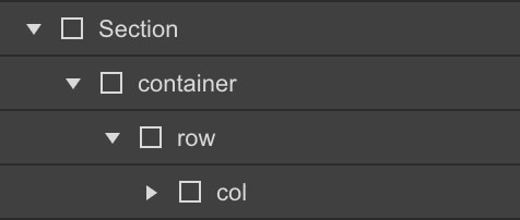
Columns need to be nested within a "row" and a direct child of a "container". All columns start off at equal-widths by defining the class of "col" and auto-collapse at the mobile portrait breakpoint if no responsive classes are defined.
col
col
col
col
col
col
col
col
col
col
Responsive Grid
Grid - Desktop
To define our 12 column grid, all classes must precede with the initial class of "col"

col-1
col-11
col-2
col-10
col-3
col-9
col-4
col-8
col-5
col-7
col-6
col-6
col-12
Grid - Tablet (Breakpoint)
Defining our tablet breakpoints, all classes must precede with the class of "col" and if defined, your desktop class of "col-(1-12)"

col-m-1
col-m-11
col-m-2
col-m-10
col-m-3
col-m-9
col-m-4
col-m-8
col-m-5
col-m-7
col-m-6
col-m-6
col-m-12
Grid - Mobile Landscape (Breakpoint)
Defining our tablet breakpoints, all classes must precede with the class of "col" and if defined, your desktop and tablet classes of "col-(1-12)"

col-sm-1
col-sm-11
col-sm-2
col-sm-10
col-sm-3
col-sm-9
col-sm-4
col-sm-8
col-sm-5
col-sm-7
col-sm-6
col-sm-6
col-sm-12
Grid - Mobile Portrait (Breakpoint)
Defining our tablet breakpoints, all classes must precede with the class of "col" and if defined, your desktop, tablet and mobile landscape classes of "col-(1-12)"

col-xs-1
col-xs-11
col-xs-2
col-xs-10
col-xs-3
col-xs-9
col-xs-4
col-xs-8
col-xs-5
col-xs-7
col-xs-6
col-xs-6
col-xs-12
Column Wrapping
If responsive columns are placed within a single row and which the total result in greater then 12, they will automatically wrap onto a new line.
col-4
col-8
col-6
col-6
col-3
col-2
col-7
Reverse Wrapping (on tablet and mobile)
Use the 'reverse-on-m' combo class on the 'row' element to reverse it on tablet. Use the 'reverse-on-sm' combo class on the 'row' element to reverse it on mobile.
col-4
col-8
col-8
col-4
Vertical Alignment
Align-Start
To align columns from the top, combine a class of "align-start" preceded by the class of "row"

align-start
align-start
align-start
Align-Center
To align columns from the center, combine a class of "align-center" preceded by the class of "row"

align-center
align-center
align-center
Align-End
To align columns from the bottom, combine a class of "align-end" preceded by the class of "row"

align-end
align-end
align-end
Horizontal Alignment
Justify-Start
To align columns from the left, combine a class of "justify-start" preceded by the by class of "row"

justify-start
justify-start
Justify-Center
To align columns from the right, combine a class of "justify-center" preceded by the class of "row"

justify-center
justify-center
Justify-End
To align columns from the right, combine a class of "justify-end" preceded by the class of "row"

justify-end
justify-end
Justify-Between
To evenly space columns between each-other, combine a class of "justify-between" preceded by the class of "row"

justify-between
justify-between
Justify-Around
To evenly space columns around each-other, combine a class of "justify-around" preceded by the class of "row"

justify-around
justify-around